Set the appearance style of Header’s each area.
Header Style
Area Settings
Header area is divided into 3 parts, Header top, Header middle and Header bottom. You can set these parts individually.
Header Area
Header Position – You can set the display position of header. Floating means that Header will cover the content area. For example: you can set header to cover Banner slider, as well as page title background. Vice versa, No Floating means it won’t cover the content area.
Header Top Area, Header Middle Area, Header Bottom Area
Settings for the 3 areas are same. The default setting of Header Top Area and Header Bottom Area are OFF, ie they won’t display. Only after choosing ON will them display.
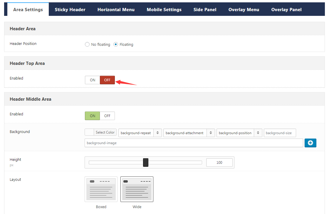
Enabled – Set whether to display the current area.
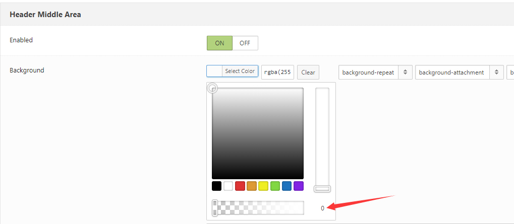
Background – Set the background color or image for the current area. If you set the color’s transparency to be 0, then header will display transparent style.
Height – Set the height of the current area.
Layout – Set the layout of the current area, Wide means the width of the current area is the same as the width of browser’s window, boxed means the width of the current area is fixed, the same as content width set in this theme.
Area Space – Set the distance between the left, middle and right blocks in the current area.
Distance between the Controls – Set the distance between the Controls in the current area.
Typography – Set the font type of controls in the current area.
Accent Color – Set the accent color of the current area.
Split Line between the Grids – Set whether to display the separator line between sections.
Bottom Line – Set whether to display the lines at the bottom of the current area.
Display Shadow – Set whether to display the shadow at the bottom of the current area.
Sticky Header
Header will remain fixed on top when scroll down page.
Sticky Header – Set whether to enable Sticky Header function.
Sticky Header Type – Set the display animation of sticky header.
Sticky Header Area – If Header section is enabled in Area Settings, then setting options for the corresponding area will show here. Based on the current area, you can set for each area individually. For example: height, background color, text color and etc.
Horizontal Menu
Set the appearance style of horizontal menu, including Main Menu, Flyout Menu and Mega Menu.
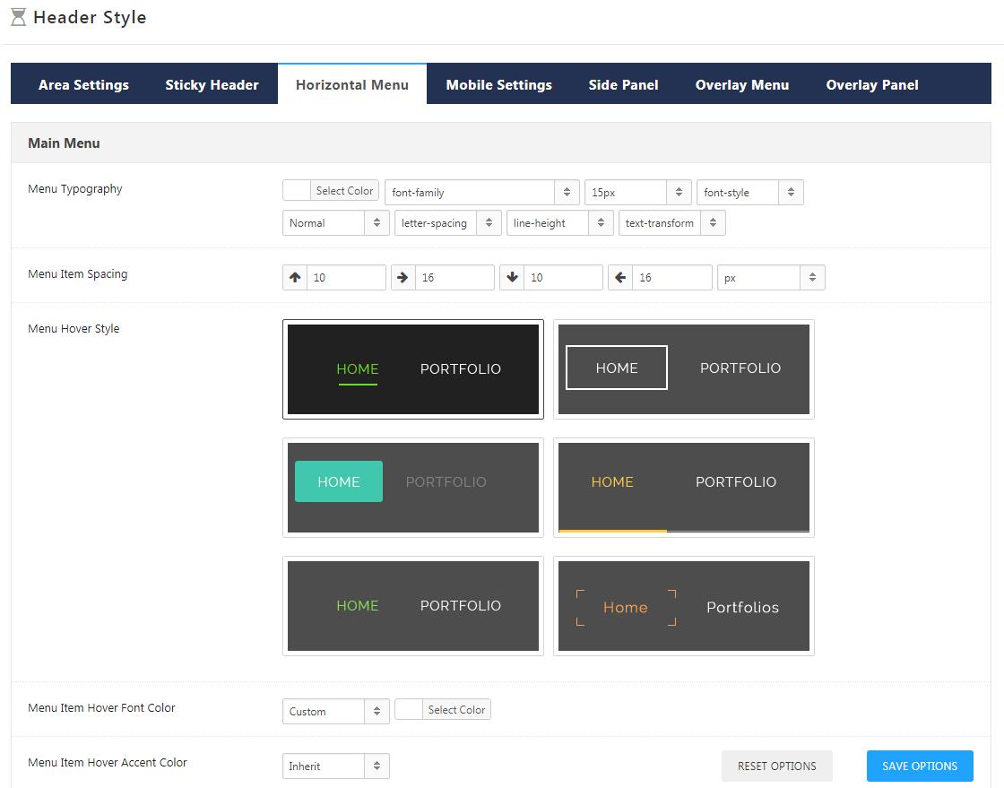
Main Menu – Set the appearance style of horizontal main menu, including settings for Menu Typography (like color, font, size, font style, font weight and etc.), Menu Item Spacing, Menu Hover Style, Menu Item Hover Font Color and Display Middle Logo. Choose different menu hover style will have different setting options.
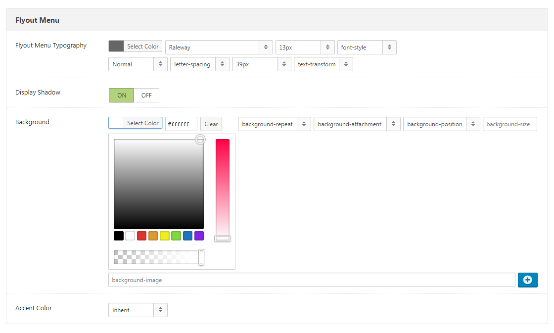
Flyout Menu – Set the appearance style of Flyout Menu (ie regular drop-down sub-menu), including the settings for Flyout Menu Typography, Display Shadow, Background and Accent Color.
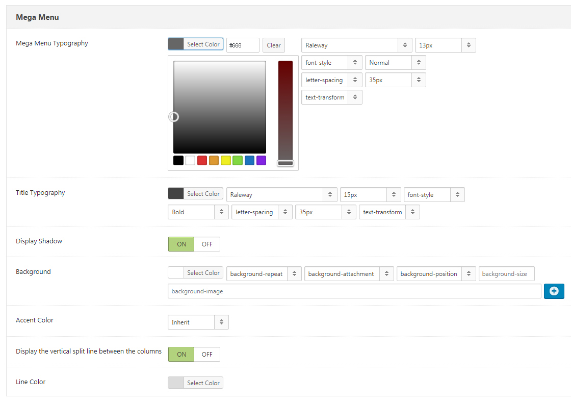
Mega Menu – Set the appearance style of Mega Menu. For example: Mega Menu Typography, Title Typography, Display Shadow, Background, Accent Color and etc.
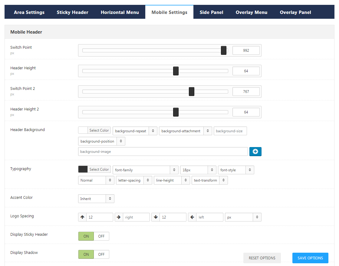
Mobile Settings
Set the appearance style of Mobile header, for example, the settings of switch point for tablets and mobile, Header height, Header background, Typography, Accent Color, and Logo spacing, whether to display Sticky Header, Shadow and Search, as well as the setting of Search Placeholder.
Side Panel
If Side Panel is used/added in Header area, then you can set its appearance style here.
Side pane includes 2 layouts, there are Menu and Content.
When choose Menu, side panel will include menu.
When choose Content, side panel will not include menu, you need to set content in Admin > DNG Layouts > Side Panels.
Nav Icon – When click Nav icon, side panel will display by sliding out.
Side Panel – Set the appearance style of Side Panel, including the Effect of Side Panel, Background, Typography, whether to display Shadow, Logo, Menu and Horizontal Split Line, Bottom Border and Accent Color.
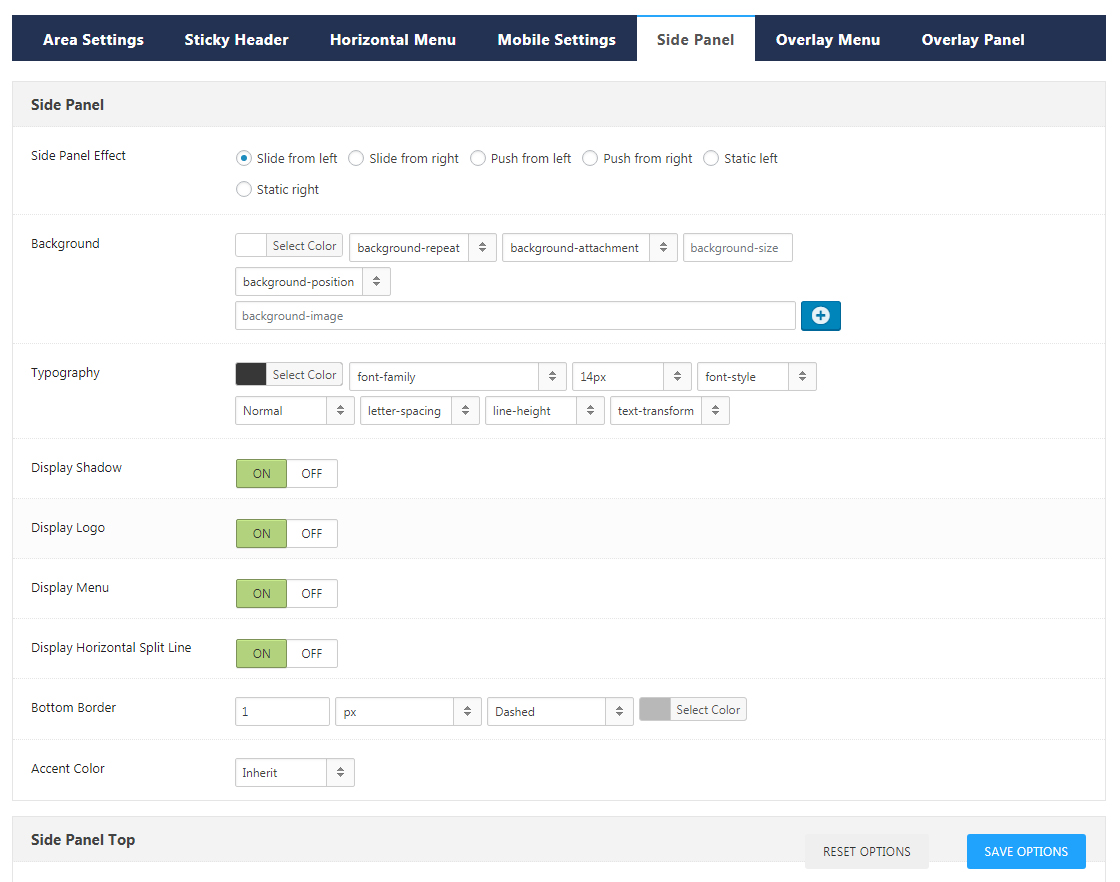
Side Panel Top – Set the distance between the top area of Side Panel and all around.
Side Panel Bottom – Set the distance between the bottom area of Side Panel and all around.
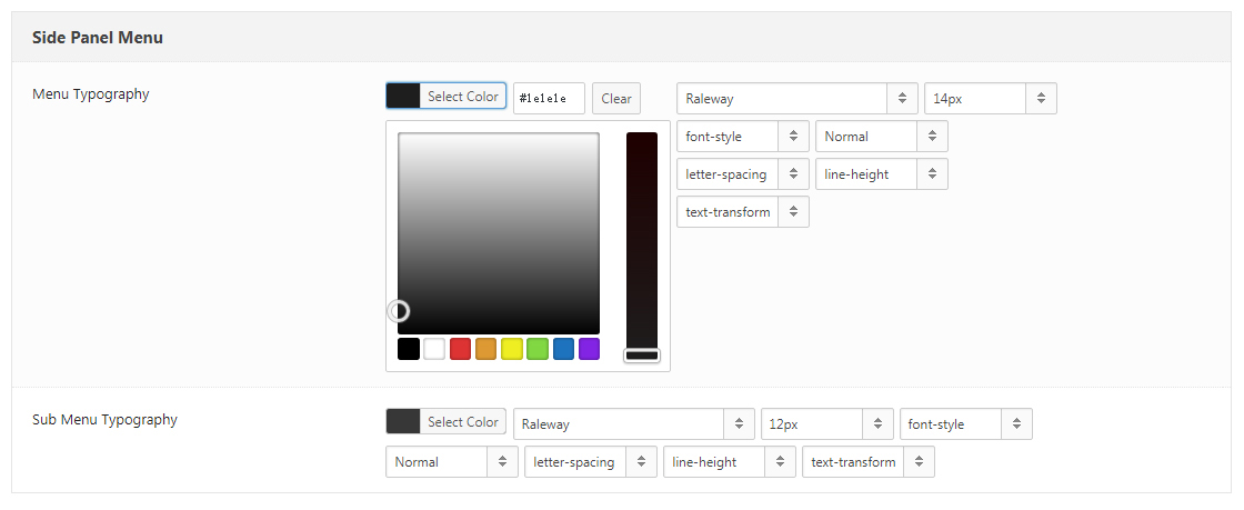
Side Panel Menu – Set the appearance style of menu in Side Panel, and the premise is that you have specified menu items for Side Panel Menu in Appearance>Menus, and the specified menu items will display at the center area of Side Panel.
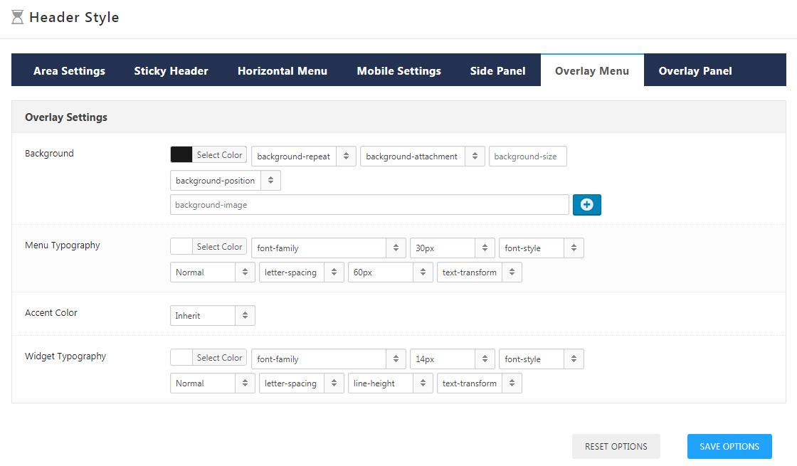
Overlay Menu
If Overylay Menu is used/added in Header area, then you can set its appearance style here. At the same time, you have to specify menu item for Overlay Menu in Appearance>Menus, otherwise menu won’t show. The settings of Overlay Menu include Background, Menu Typography, Accent Color and Widget Typography.
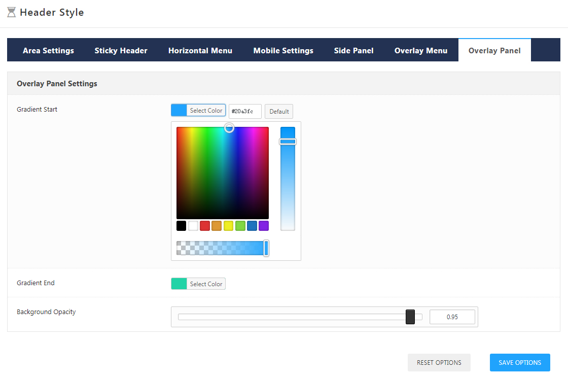
Overlay Panel
When choose nav icon, the overlay panel area will be displayed in full screen. For the content of overlay panel area, you need to set it in Admin > DNG Layouts > Over Panels.